Credit card eligibility checker
Challenge
Can we increase the confidence that a customer will be accepted for a credit card they apply for.
Solution
Integrate a soft credit check into the credit card journey.
Scope
Competitor analysis, user flows, wireframing, prototyping, user testing
Context
The banking team were looking for ways to improve the conversion rate and user experience of their credit card product tables.
An expected step in the credit card application process is to complete an eligibility check. The user enters some personal details and is given an estimate of how likely they are to be accepted for a particular card.
They partnered with HD Decisions to provide a soft credit check service for us to implement.
At the time the banking team did not have a dedicated designer. I was asked to join them for 4 weeks to start exploring ways to integrate an eligibility check into the current site.
Eligibility checking
These tools allow customers to find out, before they apply, whether they are likely to get a certain credit card. This soft credit check does not appear on a customers credit file, so doesn’t affect their credit rating.
By entering some personal information about your name, D.O.B, address and employment, each card is given a rating from 0-100 on the likelihood of acceptance.
These tools benefit users because not only can they see their eligibility across a wide range of products in one place, they also do not have to perform a hard credit check that may damage their credit score.
Problem
The credit card product tables have click out rates of around 2.6 clicks per user, but less than 1% conversion rate. It was observed that a lack of a soft credit check in advance of application may be hurting the performance of the pages.
Without an eligibility check to inform user choice, users are only able to decide on a card by features, without knowing if they will be accepted in advance. This assumption seems to be correct based on the levels of clickout vs conversion.
Users are only able to know if they are eligible on application, which is a hard credit check that remains on their credit file. This leads to a poor user experience and increased levels of frustration for potential customers.
Without helping users in the application process, our customers will only continue to blindly click out on deals that appeal to them, but then are rejected for.
Objectives
Test and implement a soft credit check for credit cards and improve the click-to-sale rate of credit card pages. Produce a roadmap for several iterations of the credit check.
Process
Because I was only with the banking team for a short period of time, we needed to work quickly to engage the team and test a version of the credit check.
I immediately arranged a call with HD Decisions to discuss any requirements they had, along with the user flows and steps in the journey.
HD Decisions
Working with HD Decisions meant we didn’t have to worry about creating our own credit checking functionality. So long as we provided the required customer details, they would return a list of cards that the user would be eligible for.
We discussed what the likely impact of implementing an eligibility check would be. From previous integrations they estimated that for users who completed the form the clickout rate would drop by around 20%, because not every card would be available to every user. However this potential drop would be offset, owing to sending more qualified customers to the retailers, by a 40% increase in sales.
Competitor analysis
Looking at a series of our competitors with eligibility checkers, they were split roughly evenly into 3 main ways to check for approval: A mandatory credit check for all users, an optional credit check for all cards and an optional credit check for a single card.
Mandatory eligibility check
This option forces all users to enter their details and perform a soft credit check before they see any credit card products.
- Gives users a true sense of what cards they are eligible for
- Users are dissuaded from clicking out on ineligible cards
- Forces users to enter details, which may put them off
- Doesn’t show the range of products on the landing page
Eligibility checking all cards
Users are able to see a list of credit card products, but then perform an eligibility check to see their rating across all products.
- Allows users to see the range of products initially
- Users get an idea of their eligibility across the whole range of products
- The card a user is interested in may become lost post credit check
- Users can still click out on products they are ineligible for
Eligibility checking a single card
Similar to checking all cards, users can see their eligibility after selecting a single card they are interested in.
- Allows users to see the range of products initially
- Users can see their eligibility on the card they desire
- Selected card is not lost within the table
- Users can’t see their eligibility across the whole range of products
- Users can still click out on products they are ineligible for
- May have to perform multiple checks across several cards
All competitors used both colour coding and a percentage or numerical range to indicate the likelihood of being accepted on application.
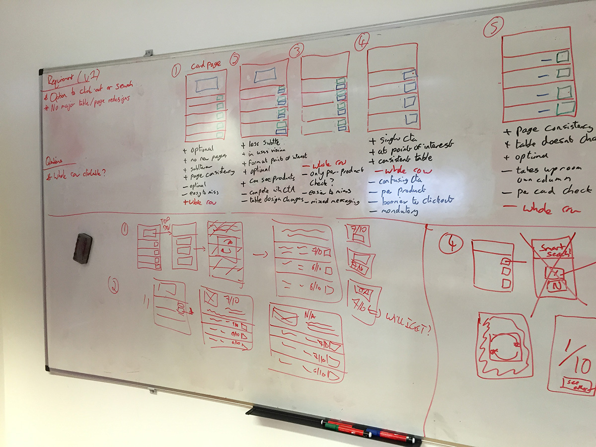
So we don’t harm the current journey, we decided that initially we would implement an optional credit check across all cards, with a following step to allow users to check a single card.
User flows
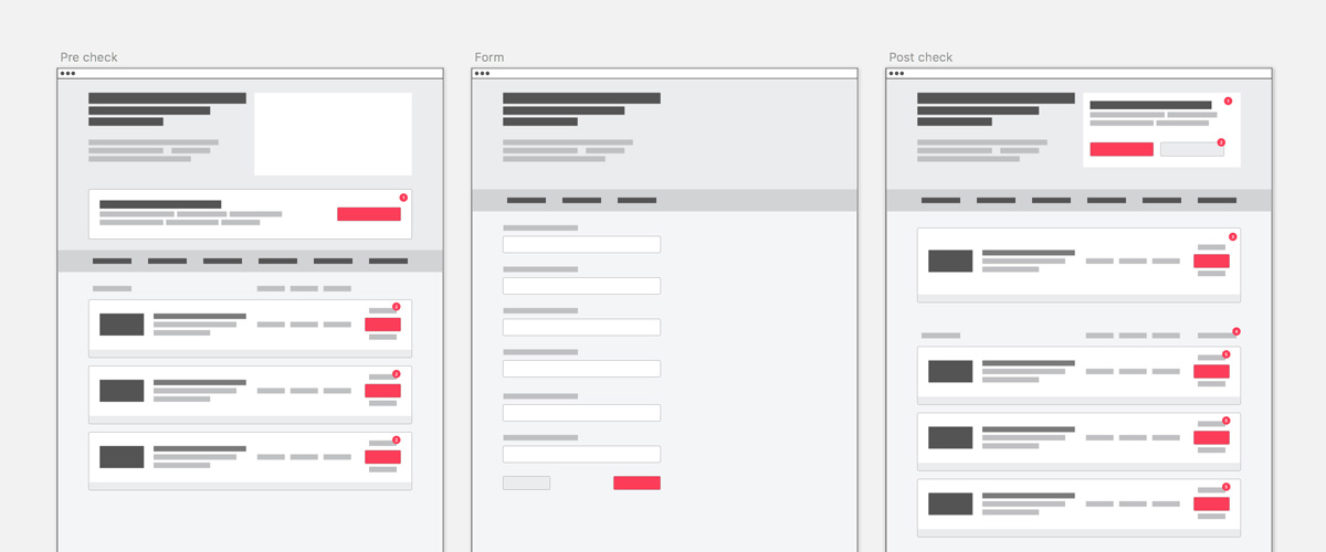
The core user flow for the eligibility checker consisted of three main steps. An initial landing page where the user was encouraged to complete a credit check, the form page where the user entered their details, and the results page where the user sees their eligibility for credit cards.

Because credit cards is made up of a main ‘all cards’ page, along with multiple card type pages, we needed to explore how users would get to their results.
Just having a single eligibility check results page would reduce complexity, but if a user was interested in a particular category of card (e.g travel, bad credit or rewards) they would find their results muddled in with other card types.
We explored several flows for customers, with options to ask what type of card a user is interested in and sending them to a category page or an all cards page, and not asking the question and just having an all cards page.
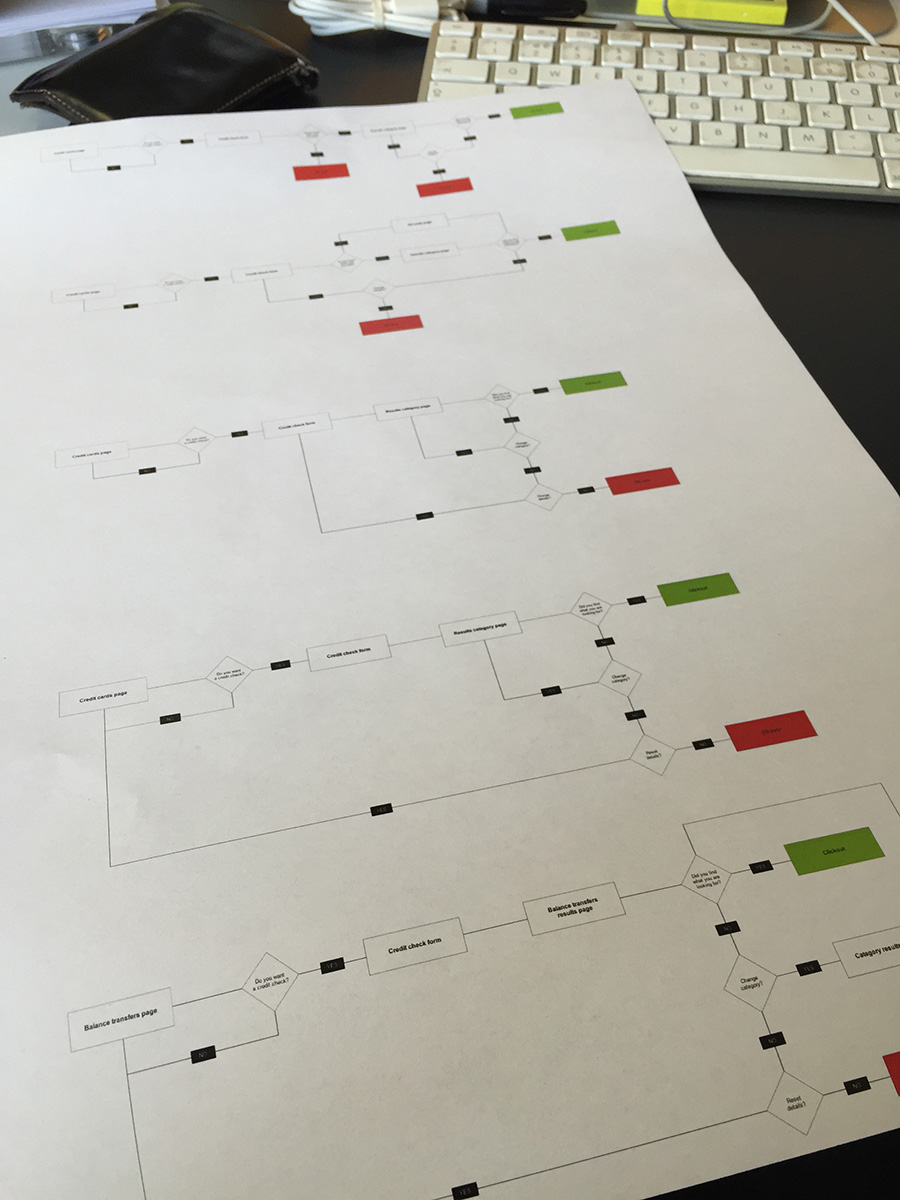
We settled on a flow that mirrored the current set of credit card pages: Users could start an eligibility check from any of our pages, we would ask what card type they were interested in within the form, and show results on a page filtered by the card type preference. If users did not know what type of card they wanted, they could see all cards mixed together on an all cards results page.
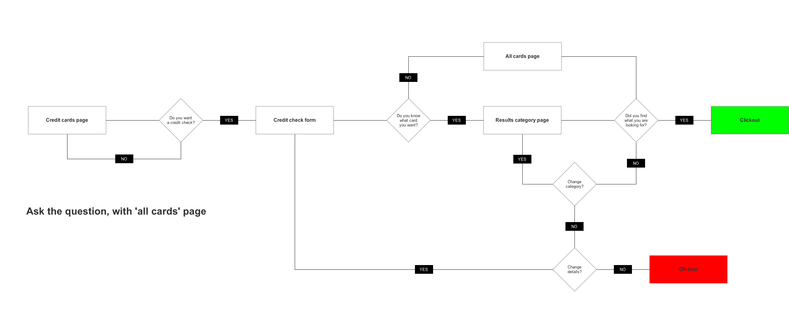
This has the benefit of matching the users expectation that they would see the same category of cards on the results page, as on the initial landing pages.
Wireframes
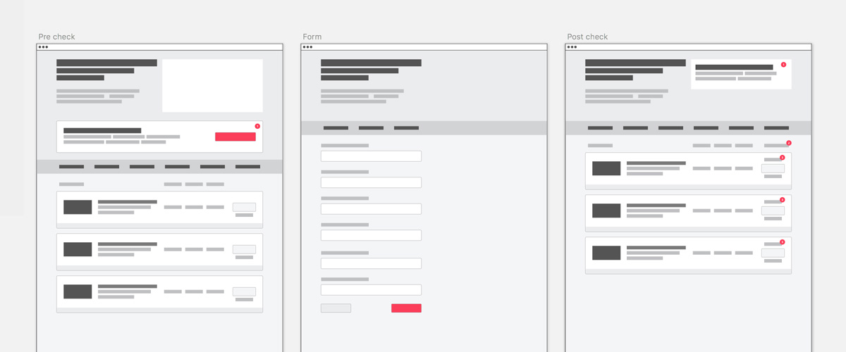
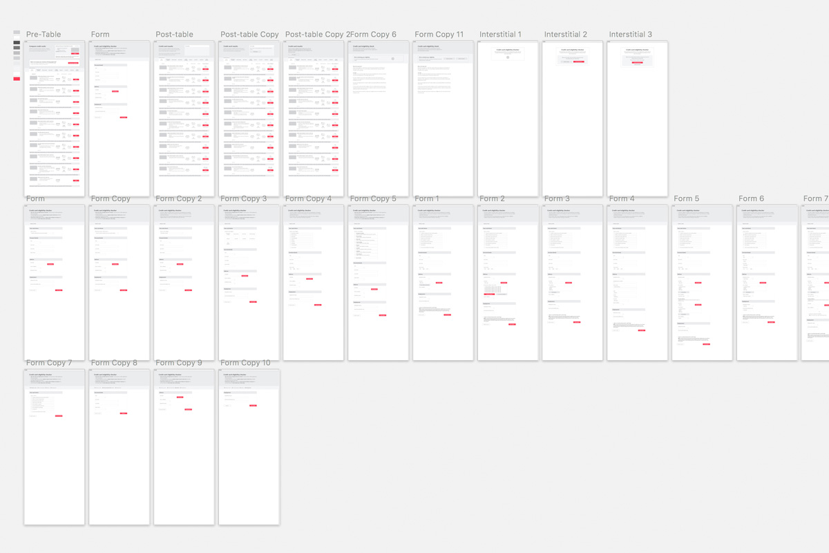
Before we began building, I created a series of low fidelity mockups to help the team understand the flows and data requirements at each step. This started with some basic blocking out of sections so everyone understood how the flow moved from the initial view, through the form to the results.
User testing
With a series of wireframes created, I combined them into a marvel prototype to test. This was tested remotely with 10 users on WhatUsersDo, and in person in a nearby coffee shop.
Overall the feedback was positive, with user expectation for each step matching what they were presented with. Some confusion was encountered with the card type question. Users were unsure if changing their mind at this step would affect the range of products they saw on the results screen.
The address input required some adjustment, with two users not being able to provide 3 years of address history. This made them unable to continue to the results, adding to their frustration. We addressed this by adding a “I don’t have a previous UK address” checkbox, allowing users to continue, but warning them of potentially a less accurate set of results.
The ordering of the results table when a user had a card selected caused some frustration. A card observed in position 3 pre-check may move to position 19 post-check, forcing the user to hunt around for their desired card. This was expected as tables were ordered by eligibility rather than most popular. A plan to address this with individual “check my eligibility” buttons on every product was agreed for the second iteration.
Results
Early results from the integration of the eligibility check were positive, with roughly 40% of users completed the eligibility check.
As expected there was a drop in clickouts to 1.7 from users who completed the eligibility test, but this was offset by a 45% increase in conversion from sending more qualified applications to the credit card providers.
When I left the banking team, they were working on the build and deployment of the first iteration of the eligibility check.
Outcomes
I left the team with a series of recommendations to continue to iterate on and improve both the eligibility checker and overall credit cards product.
Version 1
Implement the eligibility checker with a single CTA to enter the journey.
Version 2
Add per product CTAs, so users can see their eligibility on a desired card at the top of the table
Future iterations
Use accounts integration to store customer details, allowing repeat checks without re-entering personal details. Add preapproved cards and deeplink further into the application process. Improve the multiple category landing pages, simplifying the layout and number of options.