Reducing product table noise
Challenge
Can you remove noise in our product tables without compromising user choice.
Solution
Group phone colours together, turning our splash pages into colour pickers.
Scope
Competitor analysis, analytics, user testing, prototyping.
Context
Mobiles’ tables are split into two page types. Aggregate tables with deals across multiple handsets, and specific tables dedicated to a single handset, colour or memory size.
Mobile products are made of a tariff and a handset. The combination of the minutes, texts, data, network & monthly cost and the phone make, model and cost create a mobile deal.
We use a custom algorithm to give each deal a score. Based on price, data allowance and popularity, among other factors, it allows us to rank deals in a way that shows the most attractive products to users first.
One deal equals one row of our product tables. When the mobiles’ product was first created this was never an issue as handsets were released with only one colour, perhaps two at the most. Gradually over time the number of colours a phone is available in has increased and with the release of the iPhone 7 and Galaxy S7 last year this ballooned to 6 colours per memory size.
Problem
As the number of colour variants increases, the variety in our aggregate product tables decreases.
Because our deal ranking algorithm doesn’t take colour into account, it ranks all colours with almost the same score, so they would all appear clumped together within the tables.
The iPhone 7 as an example, with 6 colours, means a single deal potentially takes up 6/10 of the product table. This reduces customer choice, increases customer effort and gives the appearance of a narrower range of deals available.
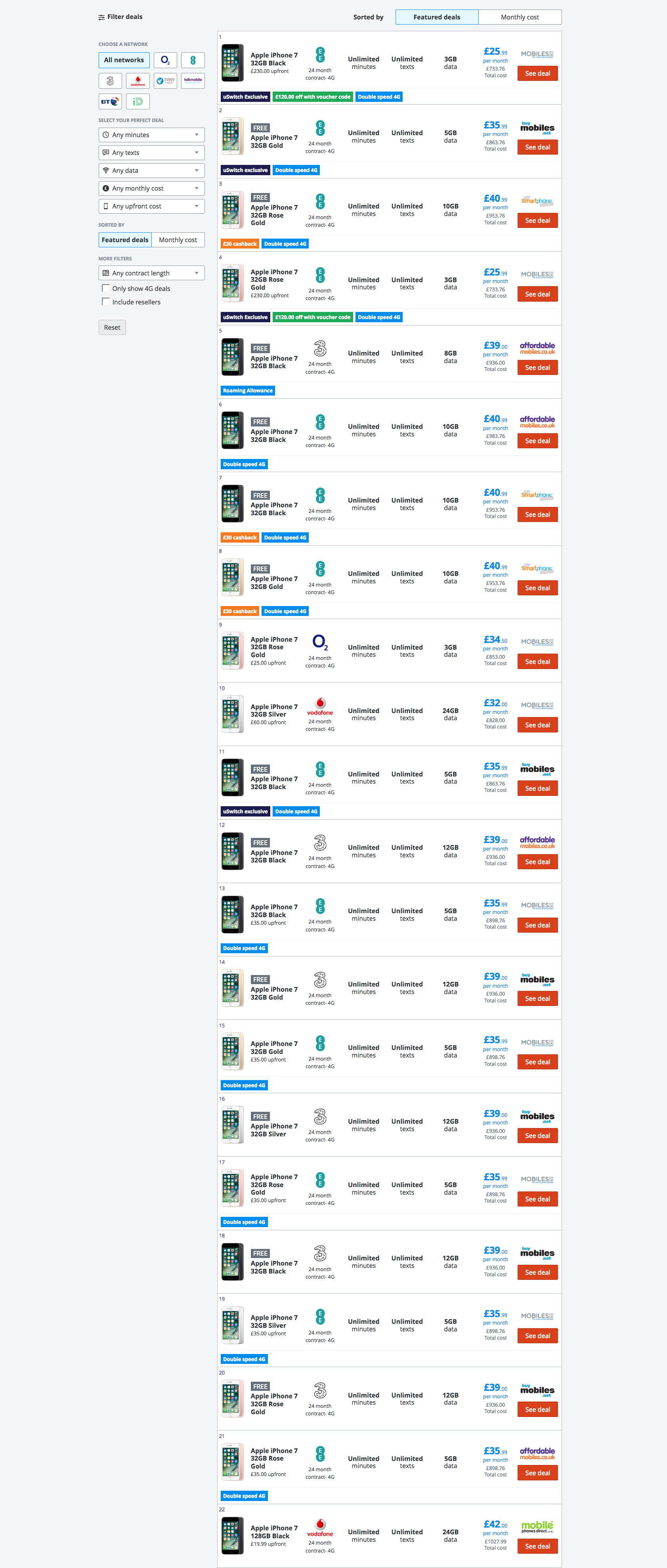
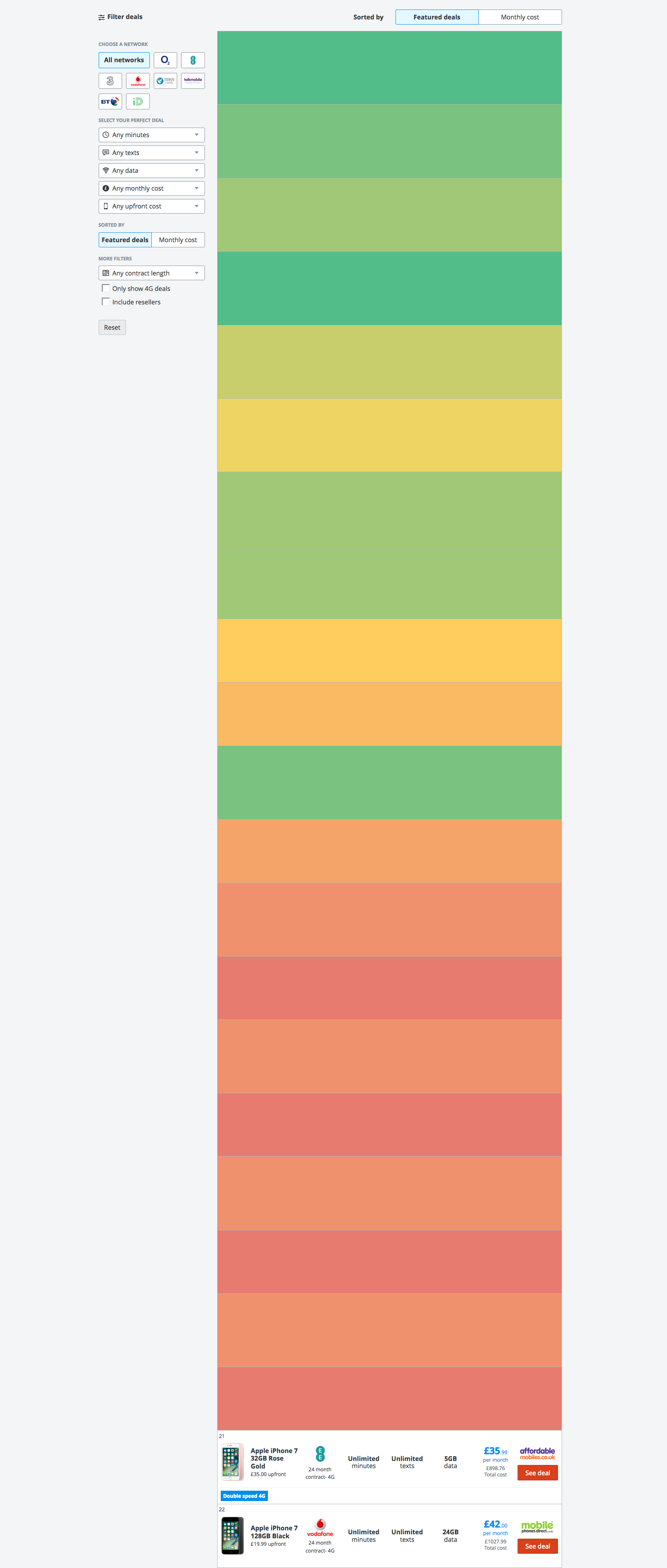
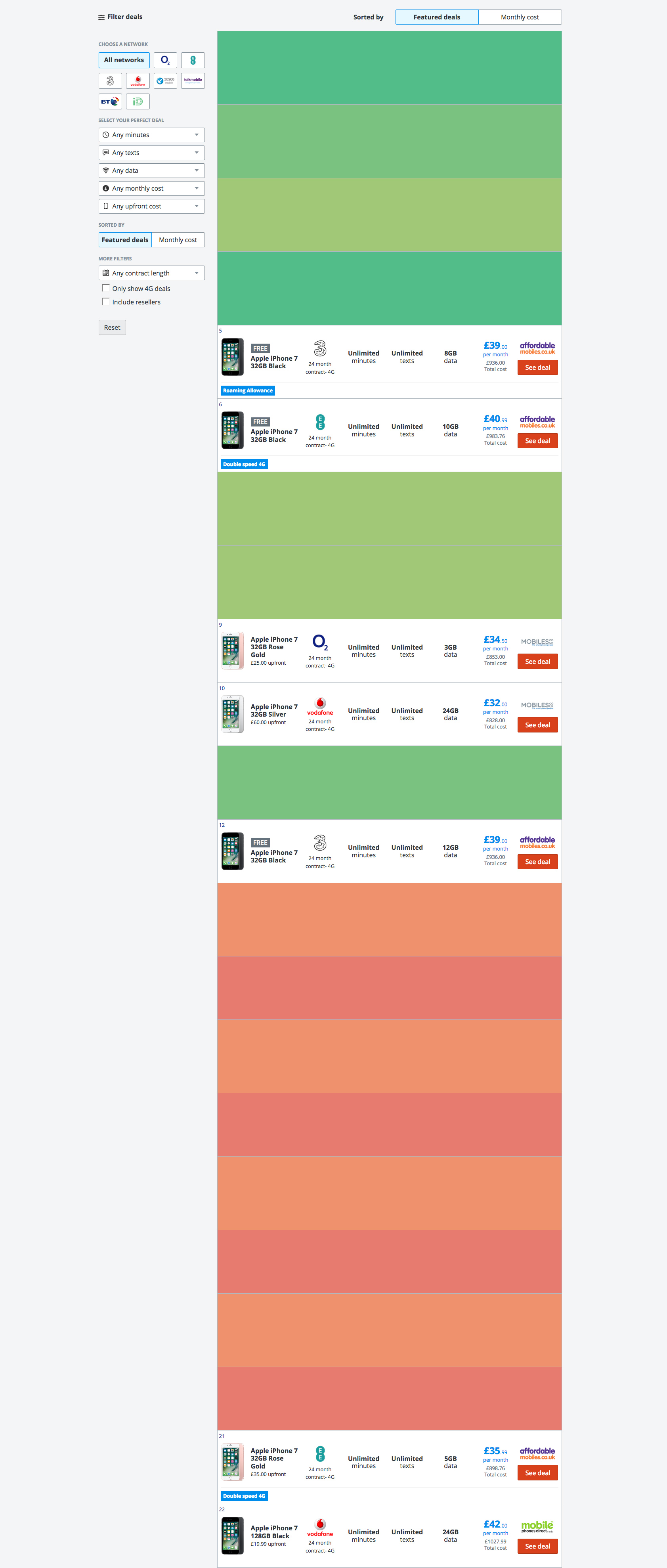
Sorting by monthly cost only exaggerated the issue, where in some cases users have to click ‘Show more deals’ 3 times before they see an 11th unique deal.


In analytics we noticed the page bounce rate and interaction with Show more deals – our ‘I can’t find what I’m looking for’ button – slowly climbing pas 30% usage. Testing with users, combined with a deeper dive into the data, suggested that the obvious duplication of deals meant users had to work harder to find what they wanted to purchase.
Objectives
Reduce the duplication of identical deals on our product tables while still allowing users to select a colour for their phone.
Reduce the bounce rate and use of Show more deals on aggregate pages.
Process
I initially began by exploring whether any competitors had encountered, or solved, this problem. It quickly became clear that no other site I looked at displayed deals across multiple phones side by side.
The majority encouraged users to pick a phone colour up front before viewing deals, with a couple allowing users to switch between colours in a table. One other site had the same issue, with multiple colours causing the table to become bloated.
User testing
I used WhatUsersDo to run a quick test of some deal pages to build understanding of the problem within the team.
I asked users some simple questions about their thoughts on the page like “what do you think of the range of deals?” and “what phones are available on this page?”.
Quotes shown to the team included “It just looks like the same phone repeated” and “do you only sell iPhone 7?”. These made it obvious that this was a problem that needed addressing.
Ideation
An early solution was to simply remove duplicate deals, show a single colour, and allow users to change colour at the retailers end. Unfortunately because we deep link into retailers baskets there is not the functionality to change colour at that point in the journey.
As a result we knew we had to solve the problem on our site. A new concept of deal groups was created by the engineering team, where so long as all component parts of a deal, apart from colour, were identical they would be grouped and manipulated as a single object. This allowed us to still give deals a ranking, but as they were based on the group, it meant you could request 10 unique deals easily.
To solve the presentation problems, with several parts of the site affected by this issue, we wanted to break down the options available to us at each step.
Product tables
The aim of the product tables is to showcase the range of deals on offer, so any solution needed to indicate a range of colours without changing the layout significantly.
I mocked up a range of ideas using our styleguide to promote discussion within the team. These included giving a count of the number of colours, showing colour swatches and allowing the user to select a colour within the buy button.
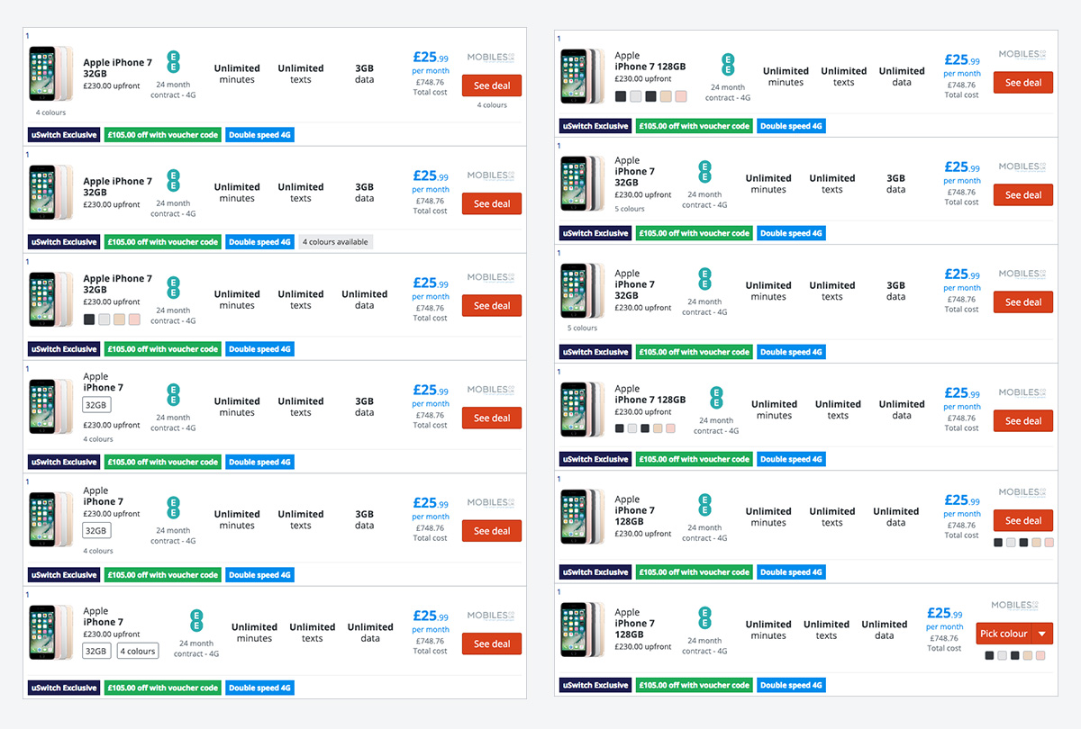
We felt that adding swatches was too fiddly and not a great experience on mobile, and selecting colours gave users too much to think about in one step. We decided to initially try a version where we stated a deal was “Available in X colours” to see if the next step matched user expectations.
Splash pages
With the understanding that a splash page now had to service a deal group, it meant the page was required to highlight multiple colours and allow one to be selected.
We considered several options which fell into two routes, have a colour selected by default, and have no colour selected and make users choose.
Default colour
- Preserves the current journey
- Allows users to click out immediately
- Users may be more likely to choose the default
- Doesn’t show the range of colours
No default
- Shows the range of colours
- More even spread of colour sales
- Prevents users clicking out initially
- Changes the current journey
We decided to test variants of both to measure users understanding and interactions with the interface.
Prototype & testing
Using Axure I created a series of prototypes, with each variation being quickly guerilla tested in a nearby coffee shop in an afternoon.

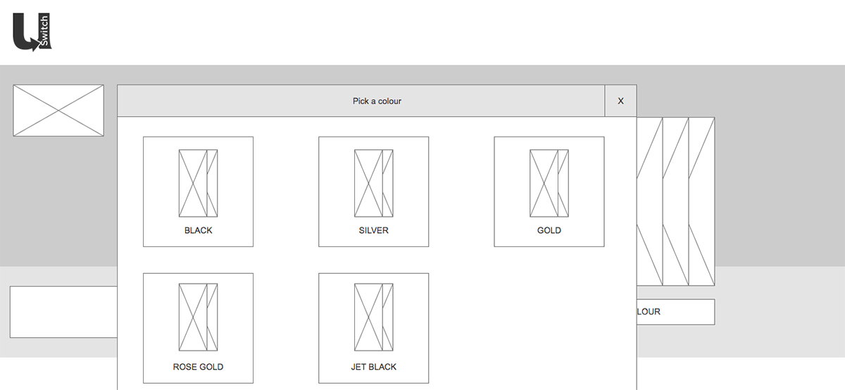
We iterated through multiple options, with the colour selector being text links, image based, radio buttons, an overlay, and drop downs. We also experimented with the buy now button being visible & active, visible & disabled and hidden to see if users knew where to interact.
We discovered that any variation we tried without the combination of both colour swatch and colour name was harder for people to interpret.
When the button was hidden users did not feel they had a clear next step, when it was disabled they understood there was another action to perform first.
In both prototypes, when on the product table, users expected to select a colour on the next page. Seeing the colour selector in some format was acceptable and understood by users.
Receiving rapid feedback allowed us to refine the concepts down to two options we wanted to re-test with users.
Design
Using our styleguide I created designs for the two final options, which were then built by the team to run as an A/B/C test.

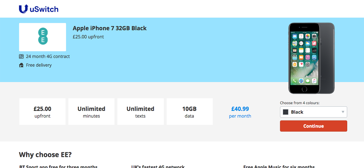
We were looking to find out if users understood that option 1 required users to select a colour first Vs option 2 which had the default colour selected.
Testing showed that although users liked seeing the range of colours in option 1, they sometimes couldn’t make up their minds and so preferred to be told what the ‘best’ colour to choose was.
Results
By creating colour groups and simplifying the table we are showing a greater variety of deals in a single view, increasing choice and reducing customer pain.
This reduction in table noise and cognitive load had a positive effect on conversion. Both options performed better than control, with option 2 having a significant 0.1% increase in conversion.
Outcomes
Option 2, with splash pages having a default colour, was selected as the winner and put live across the entire site.
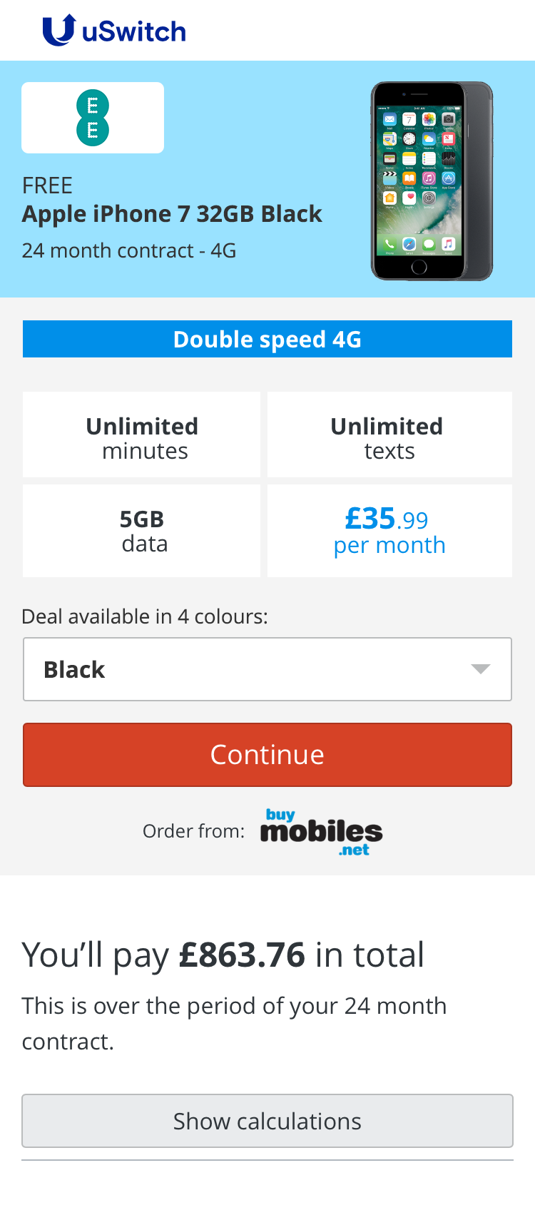
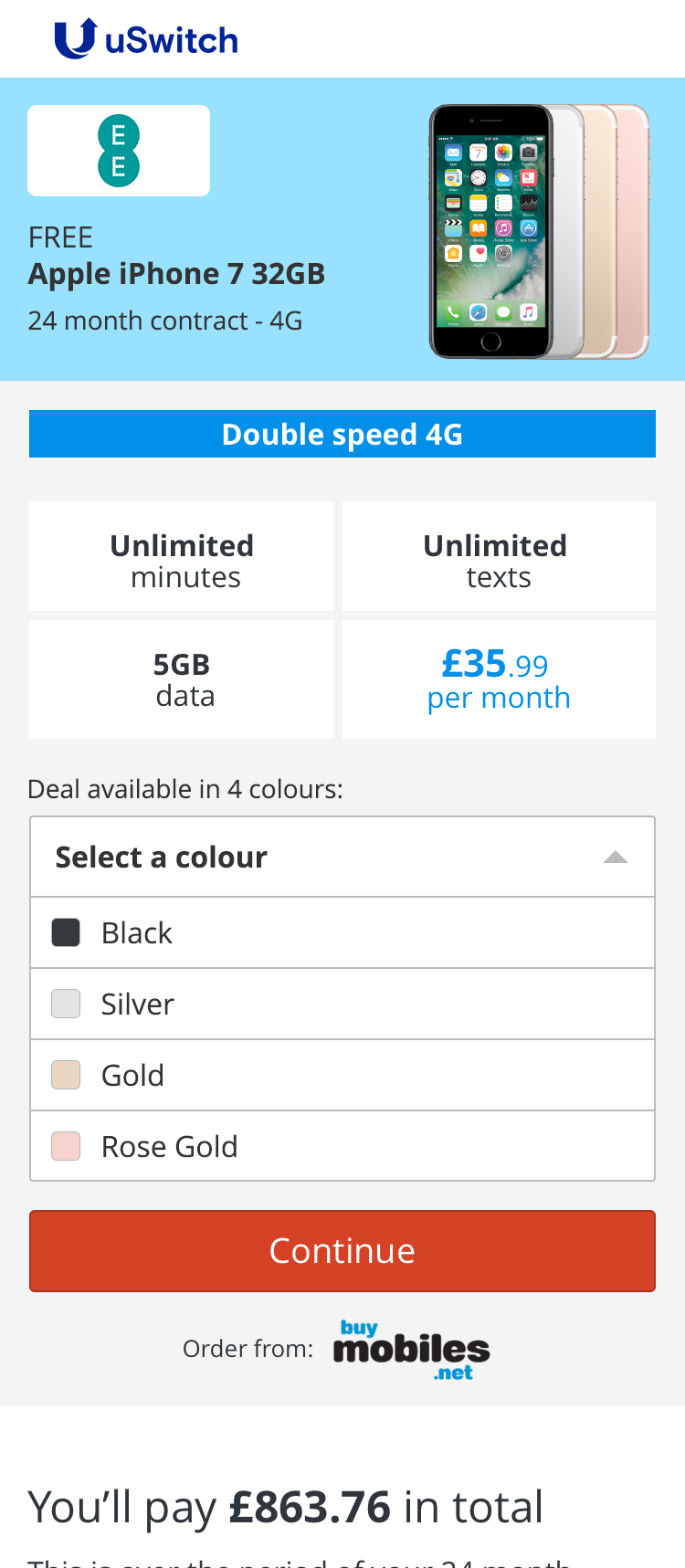
Grouping deals by colour reduced the number of deals we displayed from 90,000 to 40,000. This gave users significantly less work to perform to find their ideal mobile deal.
The usage of ‘show more deals’ very quickly returned to around 20%, levels seen before the iPhone 7 was released.
An additional effect of removing duplicate colours from the tables was that potentially identical deals from different retailers were now grouped together. We tested a quick solution whereby we removed the choice of retailers & logos from tables, but in testing all users expected that clicking on a deal would take them to the network site, rather than a retailer.
Digging into the data we found there was enough variance between retailers, such as USPs, total cost and phone colours that there would be little benefit in collapsing retailer options as well as colours on the tables.